
![]()
Plotting Your Data#
This template file shows how you can create charts (bar, line, scatter, pie).
To run the code:
Make sure you have this notebook open in Google Colab. If you are starting from the digital textbook, click
Each block of code is called a cell. To run a cell, hover over it and click the arrow in the top left of the cell, or click inside of the cell and press Shift + Enter.
Note: When you run a block of code for the first time, Google Colab will say Warning: This notebook was not authored by Google. Please click Run Anyway.
A great feature of Google Colab is that you are able to write Python code and see the output directly on your browser. Let’s go through the basics below:
import matplotlib.pyplot as plt
import numpy as np
import pandas as pd
import geopandas as gpd
import seaborn as sns
Load your data#
In Google Colab, click on the folder icon to the left of the screen. If it says “Connecting to a runtime to enable file browsing,” you may need to wait a few seconds for Google Colab to connect and load. Click the Upload icon (the left-most icon) and select your file on your computer.
You will see a pop-up that says Warning: Ensure that your files are saved elsewhere. This runtime's files will be deleted when this runtime is terminated. This is because, once you upload your data, Google Colab creates a copy of the data in your browser, which will be deleted once you close the browser. The data on your computer will remain the same, and nothing will be changed even if you make edits here in Google Colab.
Here is how to upload your data based on the different file types.
CSV (.csv) file:
data = pd.read_csv('name_of_your_file.csv')
Excel (.xlsx, .xls) file - more info here:
data = pd.read_excel('name_of_your_file.xlsx', index_col=0, sheet_name='your sheet name')
Shapefile (.shp):
if you uploaded a zipped shapefile:
data = gpd.read_file('name_of_your_file.zip')
or if you uploaded the separate shapefiles (.SHP, .DBF, .SHX, etc.)
data = gpd.read_file('name_of_your_file.shp')
GeoJSON (.geojson):
data = gpd.read_file('name_of_your_file.geojson')
# Enter code here
data =

# For example:
# data = pd.read_csv('name_of_your_file.csv')
# View first 5 rows of the table
data.head()
# View statistics like mean, min, max for each column
data.describe()
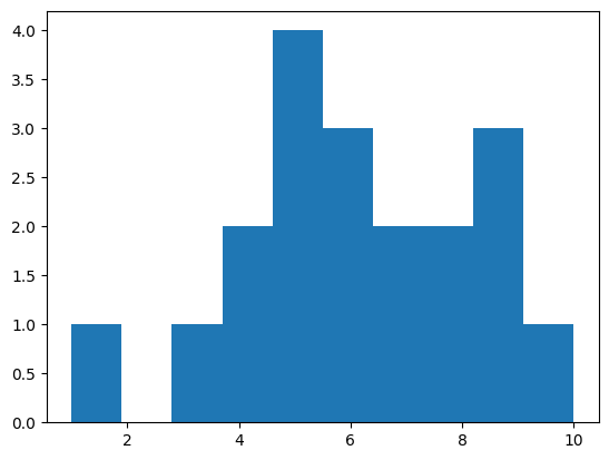
Histogram#
A histogram shows the distribution of data and can be created using the code below:
# Histogram using fake data
ex_data = [1, 3, 4, 4, 5, 5, 5, 5, 6, 6, 6, 7, 7, 8, 8, 9, 9, 9, 10]

plt.hist(ex_data, bins = 10)
plt.show()
number_of_bins = 20   # The number of bins (bars) in the histogram
column_name = ""      # The name of the column with data you want on the histogram

plt.hist(data[column_name], bins = number_of_bins)
plt.show()
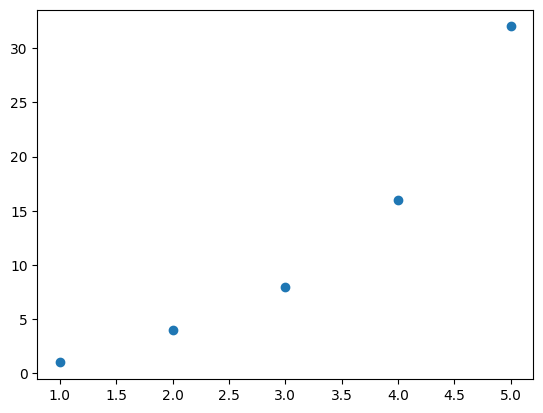
Scatter plot#
A scatter plot shows points based on two inputs (for x and y).
# Scatter plot using fake data
x = [1, 2, 3, 4, 5]
y = [1, 4, 8, 16, 32]

plt.scatter(x, y)
<matplotlib.collections.PathCollection at 0x7cdf8e1ebfd0>
xaxis_column = ""     # The name of the column with data you want on the x-axis
yaxis_column = ""     # The name of the column with data you want on the y-axis

plt.scatter(x = data[xaxis_column], y = data[yaxis_column])
plt.show()
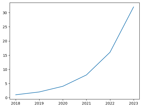
Line plot#
A line plot shows a connected line based on two inputs (for x and y).
# Line plot using fake data
years = [2018, 2019, 2020, 2021, 2022, 2023]    # x-axis
value = [1, 2, 4, 8, 16, 32]                    # y-axis (Note that this should have the same number of values as the x-axis data)

plt.plot(years, value)
plt.show()
xaxis_column = ""     # The name of the column with data you want on the x-axis
yaxis_column = ""     # The name of the column with data you want on the y-axis

plt.plot(data[xaxis_column], data[yaxis_column])
plt.show()
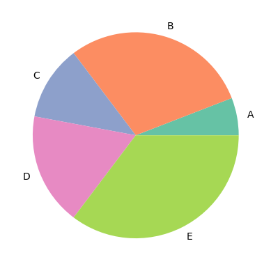
Pie chart#
A pie chart shows values based on counts of different categories.
If you already have data that are grouped, where you have one column with the categories (which will serve as the “labels” on the pie chart), and another column with the corresponding value for that category (which will serve as the size of each wedge), then this can be visualized on a pie chart directly using the following code:
# Here are some options for color palettes
display(sns.color_palette(palette='Set2'))
display(sns.color_palette(palette='twilight_shifted'))
display(sns.color_palette(palette='tab20'))
# Pie chart using fake data

wedge_sizes = [10, 50, 20, 30, 60]           # Numbers showing the size (or percent) of each category
labels = ["A", "B", "C", "D", "E"]           # The names of each category (Note that this should have the same number of values as the wedge sizes)

plt.pie(wedge_sizes, labels = labels,
        colors = sns.color_palette('Set2'))  # Color palette can be customized
plt.show()
wedge_sizes_column = ""     # Name of column that makes the size of each wedge in the pie chart (numerical)
labels_column = ""          # Name of column that makes the label of each wedge in the pie chart (categorial)

plt.pie(data[wedge_sizes_column], labels = data[labels_column])
plt.show()
If your data does not come grouped this way, then the data must first be grouped before being visualized on a pie chart using the following code:
wedge_sizes_column = ""
labels_column = ""
data_grouped = data.groupby(by=[labels_column], as_index=False).sum()

plt.pie(data_grouped[wedge_sizes_column], labels = data_grouped[labels_column])
plt.show()
You can use .sum(), .count(), .mean(), .median(), etc. to summarize the grouped values. The as_index=False updates the resulting data to have separate columns for the grouped values and labels, making it easier to use for the pie chart.
Bar plot#
A bar plot shows values based on counts (or another statistic) of different categories.
Use .bar to make a plot with vertical bars, and .barh to make a plot with horizontal bars.
# Bar plot using fake data (same as pie chart data)
bar_heights = [10, 50, 20, 30, 60]           # Numbers for the height of each category
labels = ["A", "B", "C", "D", "E"]           # The names of each category (Note that this should have the same number of values as the bar heights)

plt.bar(labels, bar_heights)
plt.show()

category_column = ""
height_column = ""

plt.bar(data[category_column], data[height_column])
plt.show()
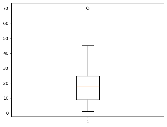
Box plot#
A box and whisker plot is helpful for seeing the general distribution of data. The box extends from the first quartile to the third quartile with a line at the median, and the whiskers extend to 1.5 times the inter-quartile range below and above the box. Any points that fall below or above the whiskers are considered “outliers” that are too small or large compared to the rest of the data.
     Q1-1.5IQR   Q1   median  Q3   Q3+1.5IQR
                  |-----:-----|
  o      |--------|     :     |--------|    o  o
                  |-----:-----|
outlier           <----------->           outliers
                       IQR
Diagram from Matplotlib
ex_data = [1, 2, 6, 8, 12, 15, 16, 19, 20, 21, 26, 30, 45, 70]

plt.boxplot(ex_data)
plt.show()
name_of_column = ""   # Name of column in your dataset with numbers

plt.boxplot(data[name_of_column])
plt.show()
Here are more resources to learn about making plots with Python: